A few years ago, I embarked on a journey to earn a Masters in Data Science. I successfully did so and graduated from the University of Michigan, which I am quite proud of; however, one downside from that journey was my final project. I had hoped to focus on a passion project of mine, which is trail running, and specifically Eastern States 100. I didn’t get enough traction from other classmates, nor was it permitted to take on a solo project, which I understood. So I took on the task of building out a machine learning pipeline and modeling aid station arrival times as a challenge for myself. What follows is the first part of that pipeline, which is the data ingestion, cleaning, and dashboard, which serves as a key deliverable for those participating in the Eastern States 100 race.
Disclaimer while I built out a majority of the initial pipeline myself, there reached a point at which I needed to move quickly and time was limited… so I relied on AI (Claude) to help me out a lot. It seems to be the way of the future and this was my first foray into having a real AI agent to assist.
The Race History
Over the years, the race has experienced some growth as well as growing pains. There has been some logistical and environmental issues to deal with, but with every running of the race, the race has only gotten better with age and, I would argue, has become a prominent 100-miler east of the Mississippi. Boasting close to 20,000’ of climbing and descending on a single loop in the remote mountains of the Pennsylvania Wilds, this course offers some great views and terrain to challenge the hardiest of runners. In 2023, the team had to change up the aid station at the most crucial point in the race - mile 60. Originally, this was Slate Run but now is Tomb Flats with the added bonus of now being a stream crossing. I’ll detail below why this is such a crucial aid station.
Let’s first look at the finish times over the years, and check out the stout course record. It may be awhile before that record falls.
Finish time by place
Every official finisher, one point per runner. Place is assigned by finish time, so each year traces a single rising curve — a curve sitting lower and further right is a faster, deeper field. The right-hand panel is the distribution of finish times: grey is every year pooled, the outline is the selected year, both as a share of their own group so one year is comparable to the whole.
Something interesting to note is the farther to the right that the dots go, the more finishers there were. I am not noting the finish stats here, but the first few years certainly experienced some low finish rates. These are official results taken from where they were published - mostly from Falcon Race Timing. The additional piece that I’ve looked at before and that offers additional insight into the race is the split timing - meaning, when did runners get into and leave the aid stations across the course. This is not always recorded though, and even when recorded, there can be some data integrity issues. Below is a summary of the different years and what was recorded.
| Year | Run | Splits | Note |
|---|---|---|---|
| 2014 | ☑️ | ❌ | Inagural year |
| 2015 | ☑️ | ❌ | No splits recorded |
| 2016 | ☑️ | ☑️ | Splits from UltraLive.net (time-in only) |
| 2017 | ☑️ | ☑️ | Splits from UltraLive.net (time-in only) |
| 2018 | ❌ | ❌ | Not run due to safety issues |
| 2019* | ☑️ | ❌ | No splits (*fastest time set) |
| 2020 | ❌ | ❌ | COVID Year (a few folks ran it anyway) |
| 2021 | ☑️ | ☑️ | Standard set for splits (in/out) |
| 2022 | ☑️ | ☑️ | Standard set for splits (in/out) |
| 2023 | ☑️ | ☑️ | Standard set for splits (in/out) |
| 2024 | ❌ | ❌ | Not run due to flooding |
| 2025 | ☑️ | ☑️ | Splits recorded for time out |
Cleaning the Data
A quick note on the data integrity:
- Splits were made available in 2016 and 2017 through UltraLive.net; however, I’m not entirely sure how they were collected. They seem accurate enough, but there are some data gaps in 2016 that are challenging to reconcile
- 2021 - 2023 had some good data collection where I got most of time-in and time-out data
- 2025 had some time-in data, but most was time-out. I would argue time-in is most important, so to try and make things apples-to-apples, I made a machine learning model that did some simple regression to determine the estimated time-in for a runner at different check points. The modeling is outside the scope of this project/post, but most of the time-in data for 2025 uses that model.
I used the data science toolkit from Kedro to create my data pipeline and visualizations to help with the structure. The current state of what that looks like currently is below:

This helped to keep the flow of the data nice organized, Kedro has a nice data catalog to keep track of how the data is flowing, and I can also use tools like a table viewer and plot viewer to assist. I built a plotly viewer in to assist with qc’ing the aid station times. This was all part of the initial data ingestion prior to any processing or feature engineering. An example of what those plots look like is below.
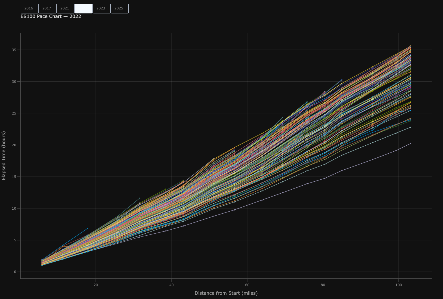
One last piece to note here before we move on. As you might imagine, as a runner is getting to a checkpoint, the volunteers recording the information simply record the time of day each person, based on bib, check’s in. There is no calculation to determine elapsed time. I had to do some math and simple checks to see whether or not a runner crossed midnight. It’s intuitive when looking at a sheet, but it was a little tricky at times.
Aid Station Arrivals
Catching the midnight crossover point wasn’t too challenging, but it wasn’t as simple as saying all runners should be past midnight at, say, aid station 8. As time goes on, the field separates more and more, and there is greater exaggeration of times between the front runners, middle of the pack, and back of the pack. This is known and expected, but depending on what aspect of the race you’re coming from (i.e., race staff, crew, runner, or aid station volunteer) this information may be helpful in different ways.
When runners arrive
Each row is one aid station, in course order. The curve on top is the shape of every recorded arrival there, pooled across all years; the bar below it is the median and middle 50%, with whiskers to 1.5× the interquartile range. The scattered points underneath are the individual arrivals. Selecting a year recolours only those points — the curve and bar stay fixed, so the highlighted year is always read against the same reference. Every runner who reached a station is counted, finishers and DNFs alike.